
Introduction
Have you ever noticed how your buying decision changes when you see a well-designed comparison chart? You may have planned to buy a budget-friendly product, but suddenly, the premium option looks like the better choice. This is no accident. Amazon sellers are using comparison charts inside A+ Content to influence customers—and it works!
In 2025, comparison charts are more important than ever. They help sellers highlight key product features, build trust, and increase conversions. But they also have a hidden trick: they guide shoppers toward the product the seller wants them to buy.
So, how do these comparison charts trick customers? And how can you, as a seller, use them to boost your sales? Let’s dive in!
In this article we will cover-
- What are comparison charts in Amazon A+ content?
- How do comparison charts influence buying decisions?
- How Amazon Sellers Can Use Comparison Charts to Boost Sales?
- Types of Comparison Chart and How to add it to the Amazon Listing?
What Are Comparison Charts in Amazon A+ Content?
Amazon A+ Content allows brand-registered sellers to add rich media to their product listings, including enhanced images, detailed descriptions, and comparison charts. A comparison chart displays multiple products side by side, showing their features, benefits, and differences.
Comparison charts help shoppers make decisions faster. But they also subtly push buyers toward a specific product, often the one with the highest profit margin or best reviews.
How Comparison Charts Influence Buying Decisions
1. Anchoring Buyers to the Best Option
One of the biggest psychological tricks of comparison charts is anchoring. When a customer sees multiple options, they naturally compare them. If you place a high-priced product first, it sets a high anchor, making mid-range options seem more reasonable.
For example:
- Product A: $199 – High-end with premium features
- Product B: $129 – Mid-range with essential features
- Product C: $89 – Budget-friendly, missing key features
By listing a premium product first, sellers make the mid-range product look like the best value. This increases the chances of selling Product B instead of the cheapest option.
2. Highlighting Strengths
Comparison charts focus on key features sellers want to highlight. If a seller knows their product lacks a certain feature, they simply avoid adding it to the chart. Instead, they showcase strengths that make their product look better.
For instance, if a seller’s product has an average battery life but a premium design, the chart will emphasize the design while keeping battery life out of the comparison.
3. Making Alternatives Look Less Attractive
Sellers use comparison charts to downplay competing products. A popular strategy is to list competitor products but leave most of their features blank or marked as “Not Available.”
By showing gaps in competitor products, your product automatically looks like the best choice.
How Amazon Sellers Can Use Comparison Charts to Boost Sales
1. Strategically Order Products
Always list products in a way that makes your preferred option look like the best deal. If you have three versions of a product—basic, mid-range, and premium—put the premium one first to set an anchor. This makes the mid-range product feel like a bargain.
2. Use Smart Checkmarks and Crosses
A simple check mark or cross can guide shoppers. If your product has key features that competitors lack, highlight them with green check marks while leaving blank spaces or red crosses for competitors.
3. Make the Upsell Look Like a No-Brainer
If you sell multiple products, use comparison charts to encourage customers to buy higher-priced options. Show that the premium version offers significantly more value for just a small price increase.
For example, instead of:
- Basic version: $50
- Premium version: $100
Position it like this:
- Basic version: $50 (Limited features)
- Premium version: $100 (Everything in Basic + 5 extra features)
This makes the premium version look like a great deal.
4. Highlight Reviews and Best-Sellers
If one of your products has better ratings, use the comparison chart to display those reviews. A simple “Best Seller” or “Top Rated” badge can make a huge difference in persuading customers.
Types of Comparison chart on Amazon Listing
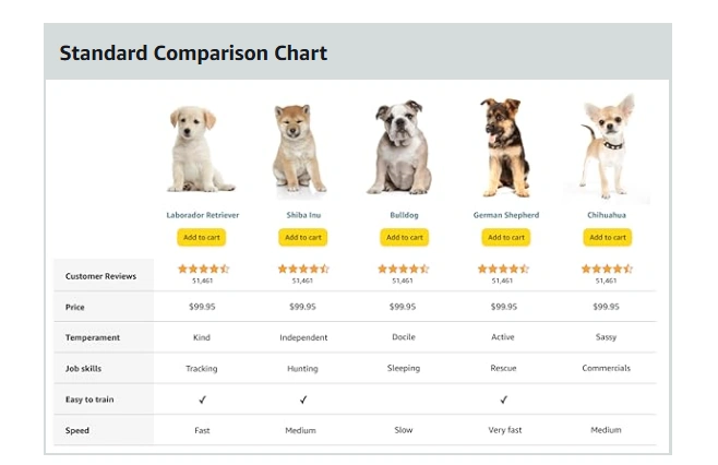
You can find a comparison chart in both Basic A+ content and in Premium A+ content. Now in the basics you do not have any other different style. There is only one type of comparison chart in basic A+ content on Amazon listings.
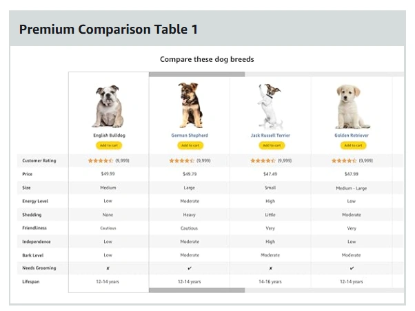
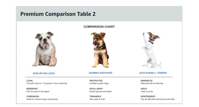
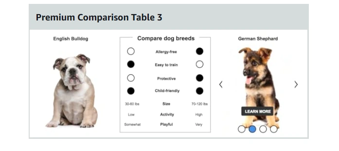
On the other hand, premium A+ content offers up to three different comparison charts.
It provides more flexibility to highlight alternative products within the brand, showcase competitor advantages indirectly, and present different feature sets to influence buyer choices.
In the fast-moving world of e-commerce, where attention spans are short, the right comparison chart isn’t just a feature—it’s a silent salesman guiding customers toward a purchase.
Conclusion
Comparison charts in Amazon A+ Content are a powerful tool for influencing buying decisions. By using smart positioning, feature highlights, and strategic pricing, you can guide shoppers toward your most profitable products.
As an Amazon seller in 2025, mastering these subtle tricks can boost conversions and increase sales. Just remember—use them wisely. Customers appreciate transparency, and the best way to build a strong brand is to provide real value.
Are you using comparison charts in your A+ Content? Start optimizing them today and watch your sales grow!
If you need any help regarding making comparison charts or tweaking the main images or overall listing optimization we can help you with that. Mail us at info@comclips.com with the questions or concerns, we will get back to you soon.