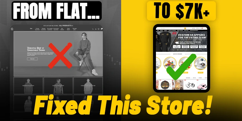
Struggling to increase sales from your Shopify store? You’re not alone. Many store owners have a great product, but their store layout, design, and user experience silently kill conversions. In this detailed case study, we’ll show you how we at Ecomclips completely transformed a client’s underperforming Shopify store, boosting sales by 66% and increasing conversion rate by over 50% – without changing a single product.
Whether you’re just starting or already scaling, this is your blueprint for turning browsers into buyers using real-world UX and CRO tactics that work in 2025.
The Problem: A “Decent” Store That Wasn’t Converting
A store can look fine at first glance, clean layout, great product images, even decent branding — yet still fail to convert visitors into paying customers. That was the exact scenario our client was facing. Despite having a high-ticket product and a seemingly functional store, their metrics were stagnant. A conversion rate of just 0.4% meant hundreds of visitors were leaving without buying.
It was clear something was broken. We needed to dive deep into the user experience, layout, and content flow to identify what was turning people away.
- Conversion rate: 0.4%
- Sales: Flat
- Drop-offs: High on mobile and checkout
Our Approach: UX Overhaul Without Changing Products
Many store owners assume they need new products or more ads to increase sales. But often, the real solution lies in better design. For this client, we kept the product catalog exactly the same. Instead, we focused on refining the store experience to build trust, guide users, and remove friction.
On May 1st, 2025, we launched a full-store redesign with data-backed changes aimed at increasing usability and boosting conversion rates. Here’s a breakdown of our updates:
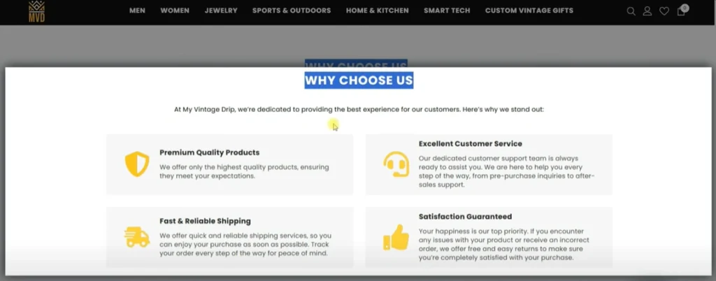
Homepage Optimization
The homepage is the digital storefront — it’s where first impressions are made. When visitors land here, they should instantly understand what you sell, why you’re different, and where to go next. Our client’s original homepage was cluttered, vague, and lacked direction.
We cleared the noise and brought clarity. Our redesign emphasized trust, navigability, and value-driven messaging right at the top.
- Removed visual noise
- Added a clean value-driven hero banner
- Introduced category blocks and featured collections
- Included a “Why Choose Us” section with:
- 🚚 Fast shipping
- 🔁 Easy returns
- 💬 24/7 customer support

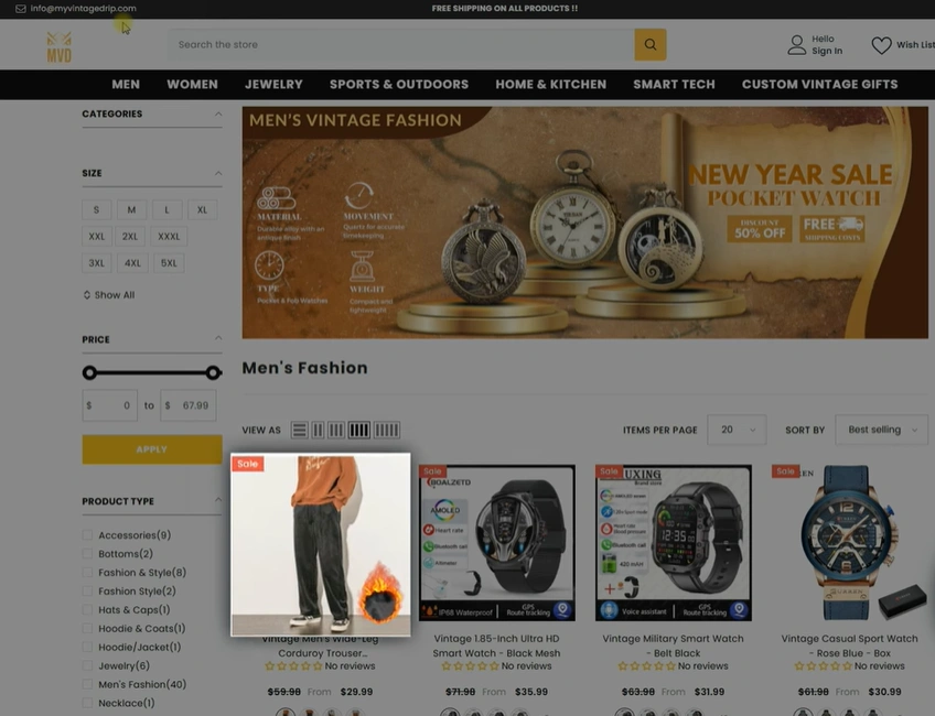
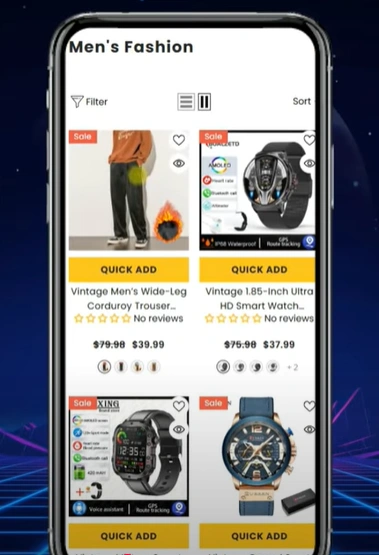
Collection Page Improvements
Collection pages guide shoppers through your product catalog, but when they’re unorganized, users quickly lose interest. Our client’s collection pages were inconsistent, hard to filter, and lacked a strong mobile experience — which was a deal-breaker, especially for younger shoppers.
We improved usability and standardization so customers could browse with less effort and more confidence, especially from mobile devices.
- Standardized product image sizes
- Simplified filter menus
- Optimized for thumb-friendly browsing on mobile
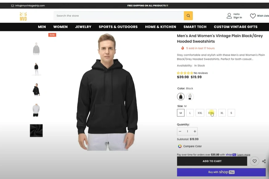
Product Page Overhaul
The product page is where decisions are made. It’s where emotion meets logic. Yet, our client’s product pages were a mess — long blocks of unformatted text, no clear hierarchy, and minimal social proof. Customers had no reason to trust or stay.

We completely restructured the content, layered in psychological triggers like reviews and urgency, and improved every interactive element for mobile and desktop.
- Structured the product description with headers and bullet points
- Added product reviews and ratings
- Improved image gallery with zoom
- Optimized variant selectors for mobile
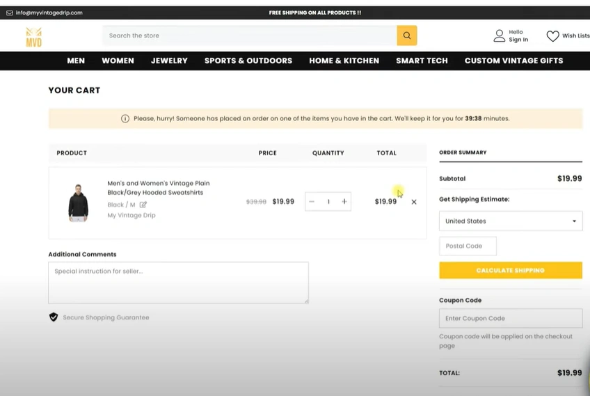
Cart Page Optimization
The cart is where you either close the sale — or lose it. And unfortunately, the original cart design was leaking potential sales due to distractions and a confusing checkout experience. Small issues here cause big revenue losses.
Our goal was to create a seamless and focused final step that encouraged customers to move forward with confidence — and even spend more.
- Cleaned up layout and eliminated distractions
- Focused the CTA with a clear “Proceed to Checkout” button
- Added a bestseller carousel to promote upsells and increase AOV
The Results: Before vs. After (60 Days Later)
So, did it work? Absolutely — and the results speak for themselves. We didn’t touch the products or pricing. Every improvement came from redesigning the store experience, and within 60 days, our client saw a massive jump in key performance metrics.
These aren’t vanity numbers. They represent real growth, real buyers, and a real boost in profitability — proving the ROI of UX and CRO.
📅 Before: March 1 – April 30
📅 After: May 1 – June 30
- Sales increased by 66%: From ~$4,300 → $7,200+
- Conversion rate jumped 51%
- Orders rose 43%
- Cart additions up 48%
- Checkout completions improved 36%
- AOV increased by 16%
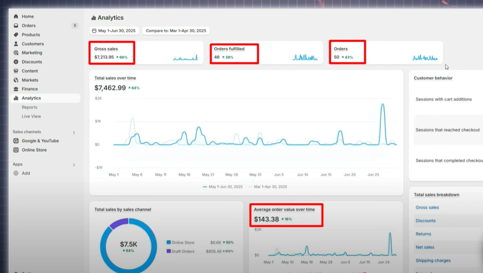
No new products. No new ads. Just better design.
What You Can Learn (and Apply Right Now)
These results aren’t limited to our client — you can apply these lessons to your store right away. From fixing friction points to showcasing trust signals, these simple changes can make a massive impact on your bottom line.
Whether you’re DIY-ing your store or working with a developer, here’s what you should focus on first:
Identify Your Friction Points
Use heatmaps, session recordings, and analytics to see where customers drop off.
Build Trust Into the Design
Highlight return policies, fast shipping, customer support, and genuine reviews.
Prioritize Mobile Experience
If it’s not smooth on mobile, you’re losing over half your potential revenue.
Test and Track Everything
Don’t guess. Make data-driven changes and track how users respond.
Final Thoughts: Your Store Design Is Your Sales Strategy
This Shopify store revamp proves that conversion rate optimization isn’t fluff — it’s a powerful growth lever. A great product still needs a smart, smooth store to win trust and close the sale. Design isn’t just about aesthetics — it’s your silent sales machine.
If your store isn’t converting, don’t just throw money at ads or new products. Fix your foundation first.
Want Us to Fix Your Store?
If your Shopify store is underperforming, we can help. At Ecomclips, we specialize in conversion-focused redesigns that turn browsers into buyers — without increasing your ad budget.
📩 Contact us at: info@ecomclips.com
🔧 Let’s optimize your store — and grow your brand.
Explore More from Ecomclips
- Shopify Store Isn’t Getting Sales in 2025? Fix It Now
- Design Shopify Homepage That Converts in 2025: A Complete Guide
- 10X Shopify Conversion Rates & Revenue (CRO Guide 2025)