In today’s fiercely competitive eCommerce marketplace, especially on Amazon, having ordinary product listings is simply not enough. Shoppers are exposed to thousands of products daily — which means your listing, particularly your A+ Content, must stand out both visually and contextually to win conversions.
Many sellers assume that A+ Content is just an add-on feature. But the truth is — bad A+ Content hurts your conversion rates, damages trust, and wastes golden opportunities for SEO.
This guide explains exactly why your A+ Content might be killing your sales and shows you how to fix it step-by-step with proven, professional strategies.
Table of Contents
| What is Amazon A+ Content |
| Why is A+ Content Crucial for Conversion & SEO? |
| Top 5 Fatal Mistakes Sellers Make (And How to Fix Them) |
| The Proven Structure for Winning Basic A+ Content |
| Premium A+ Content: Must-Have Elements for Maximum Impact |
| Advanced Tips to Supercharge A+ Content Performance |
| Why Ecomclips A+ Content Strategy Delivers Better Results |
| Conclusion — Your A+ Content Upgrade Checklist |
1. What is Amazon A+ Content?
Amazon A+ Content, previously known as Enhanced Brand Content (EBC), is a premium feature designed specifically for brand-registered sellers on the Amazon marketplace. This powerful tool allows sellers to go beyond the basic product description by offering rich, visually engaging media and detailed product information that helps potential buyers make informed purchasing decisions.
With A+ Content, sellers can create an enhanced product detail section that not only informs but also builds trust and boosts conversion rates. By integrating this feature into your product listings, you provide shoppers with a complete, immersive shopping experience that reduces uncertainty and answers common pre-purchase questions directly on the product page.
Here are some essential elements you can add using Amazon A+ Content:
- Lifestyle Images
Showcase your product in real-life scenarios to help customers visualize how it fits into their daily lives. - Detailed Feature Graphics
Use custom graphics to highlight the key features and benefits of your product, making it easier for customers to understand what sets your item apart from competitors. - Comparison Charts
Provide side-by-side comparisons of different product models or variations, helping shoppers make quick and confident buying decisions. - Videos
Add short product demonstration videos or explainer clips to give customers an even closer look at your product’s use and advantages. - Text-Based Modules
Include extra descriptive sections to explain product details, usage instructions, or brand story—offering more context that drives conversions.
2. Why is A+ Content Crucial for Conversion & SEO?
Here’s why ignoring or misusing A+ Content is a dangerous mistake:
- Boosts Conversion Rate (CVR): High-quality A+ Content can boost conversions by 3%-10%.
- Improves SEO Visibility: Crawlable text and structured layout increase organic ranking potential.
- Enhances Brand Trust: Visual brand storytelling elevates perceived value and builds credibility.
- Reduces Returns: Clear, informative visuals reduce customer confusion.
- Cross-Selling Opportunity: Comparison charts and product grids promote other ASINs.
3. Top 5 Fatal Mistakes Sellers Make (And How to Fix Them)
Mistake #1: Walls of Text
One of the most common mistakes sellers make when creating Amazon A+ Content is filling the page with long, dense paragraphs—often referred to as “walls of text.” This overwhelms potential customers and drives them away from your listing.
Why? Because shoppers on Amazon don’t read—they scan. Their eyes quickly move from section to section, looking for highlights, images, and quick information. When they encounter heavy blocks of uninterrupted text, their attention drops, and chances are, they’ll skip your listing for a competitor’s that is easier to digest.
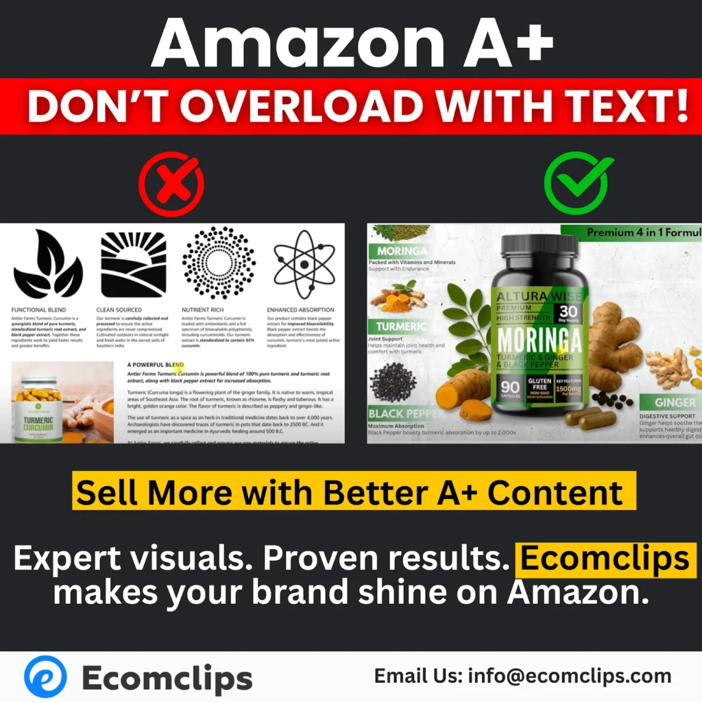
Long, wordy descriptions kill clarity and reduce engagement. Even if your product is great, poor content formatting can make it seem boring or complicated.
Solution:
To avoid this, apply these best practices:
- Use short, punchy text chunks
Break your information into small, easy-to-scan sentences or bullet points. - Incorporate infographic-style modules
Use visuals that highlight key features rather than describing everything in words. - Deliver key points via visual callouts, not paragraphs
Make important product benefits stand out through icons, labels, or highlighted sections so shoppers catch them immediately without reading long text.
SEO Tip:
While it’s crucial to make your content visually clean and simple, don’t forget to embed essential keywords in crawlable text areas. However, always keep this text brief and to the point to maintain clarity and avoid cluttering the listing.
Mistake #2: Poor Quality or Unclear Images
Problem:
- Blurry or pixelated images lower product perception.
- Confusing overlays make content unreadable.
- Stock images without context reduce trust.
Example:
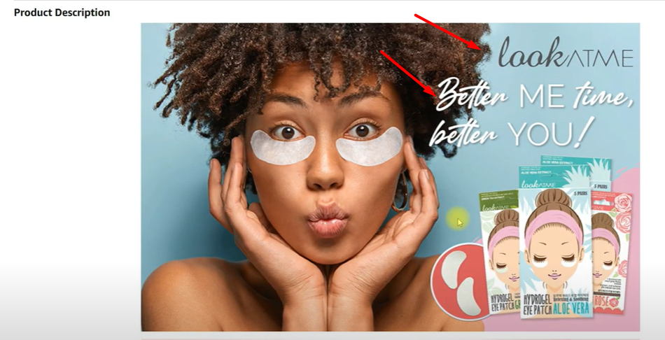
A brand adding multiple small icons and unclear text on images creates chaos, not clarity.
Solution:
Use professional, crisp, high-resolution images
Include lifestyle shots showing real product usage
Remove cluttered elements or overlapping graphics
SEO Tip:
Use Alt Text (backend) on every A+ image for Amazon SEO ranking.
Mistake #3: Lack of Visual Flow
Another critical mistake in Amazon A+ Content design is the lack of visual flow. When sellers use the same module structure repeatedly—such as stacking identical image-and-text boxes—your listing begins to feel predictable and boring. This creates a visual dead-end where the shopper’s eye gets stuck or even lost, making them more likely to leave the page instead of exploring further.
Online shoppers crave variety. When there is no change in layout or content type, their attention fades fast. Without a dynamic, well-structured flow, your A+ Content can unintentionally push potential buyers away—even if the product itself is excellent.
Solution:
To create an engaging and effective visual journey, follow these best practices:
- Mix different modules
Use a combination of wide banners, 4-image grids, and comparison charts to keep the viewer’s interest alive. - Break visual monotony with videos and lifestyle images
Add motion and real-life context through short video clips and lifestyle shots that show your product in action. - Tell a story with the layout
Structure the content like a narrative: Start with a brand introduction, move into detailed product features, follow up with comparison sections, and close with a clear Call-to-Action (CTA). This story-like experience keeps the viewer curious and scrolling.

SEO Tip:
A+ Content that flows visually encourages shoppers to stay on the page longer, increasing dwell time and positive engagement metrics. These factors are not only great for conversions but also contribute to better ranking in Amazon’s algorithm.
Mistake #4: Ignoring Video Modules
Problem:
- Sellers skip video modules even with Premium A+ access.
Videos are proven to increase buyer trust and understanding by up to 80%.
Solution:
Include at least one short explainer video.
Showcase product usage, benefits, and lifestyle demonstration.
Use subtitles for silent autoplay.
SEO Tip:
Videos engage mobile users — key for Amazon’s mobile-heavy traffic.
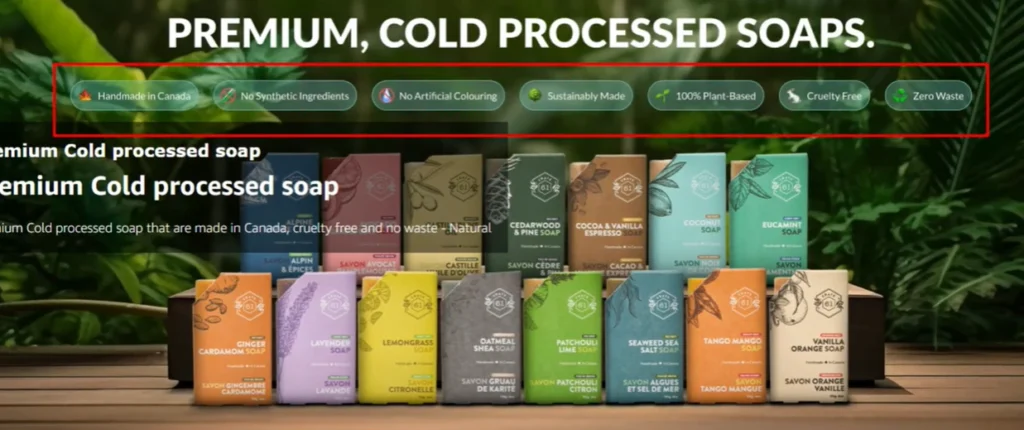
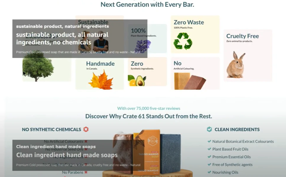
Mistake #5: Failing to Highlight Unique Selling Points (USPs)
Problem:
- Many listings talk about “high-quality,” “eco-friendly” — but so does everyone else.
- Without specific USPs, your product feels generic.
Solution:
– Highlight what makes your product better — patent features, special ingredients, award wins.
– Use trust badges (certifications, guarantees) visibly.
– Add comparison charts showing your superiority over competitors.
SEO Tip:
Position high-impact keywords near USPs for relevance boost.
4. The Proven Structure for Winning Basic A+ Content
When creating Amazon Basic A+ Content, your structure and flow are everything. Since this version of A+ Content comes with limited design options compared to Premium A+, making the most of your available modules is crucial. A well-planned structure ensures that your product story feels complete, convincing, and easy for shoppers to follow.
Here’s an ideal structure to guide you:
1. Start with a Strong Brand Story
Begin with your brand’s essence. Include your logo, tagline, and an emotional hook to connect with the audience immediately. This introduction builds familiarity and trust from the first glance.
2. Feature-Rich Blocks
Move on to showcasing your product’s key features. Use short, clear text combined with clean, high-quality images to highlight benefits without overwhelming the viewer. This helps keep the content scannable and impactful.
3. Lifestyle Imagery
Next, introduce lifestyle images that show your product in real-world use. This step humanizes your offering, helping shoppers imagine how your product fits into their own lives—making the buying decision easier.

4. Comparison Chart
Include a comparison chart to set your product apart from competitors. Clearly display what makes your item better—whether it’s more features, higher quality, better pricing, or superior design.

5. Final Trust Nudge
End your Basic A+ Content with a trust-building section. This can include warranty details, certifications, or real customer reviews to reassure buyers of your product’s quality and reliability. It serves as the final gentle push that converts hesitation into purchase confidence.
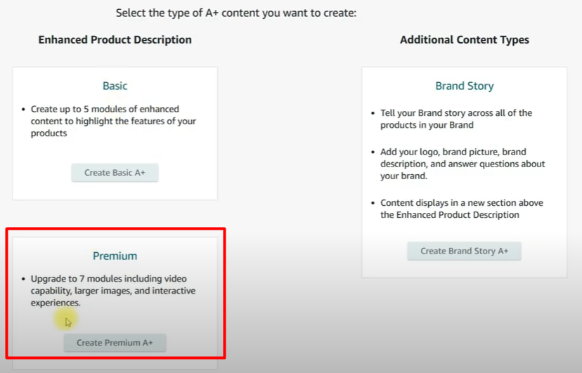
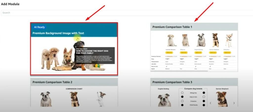
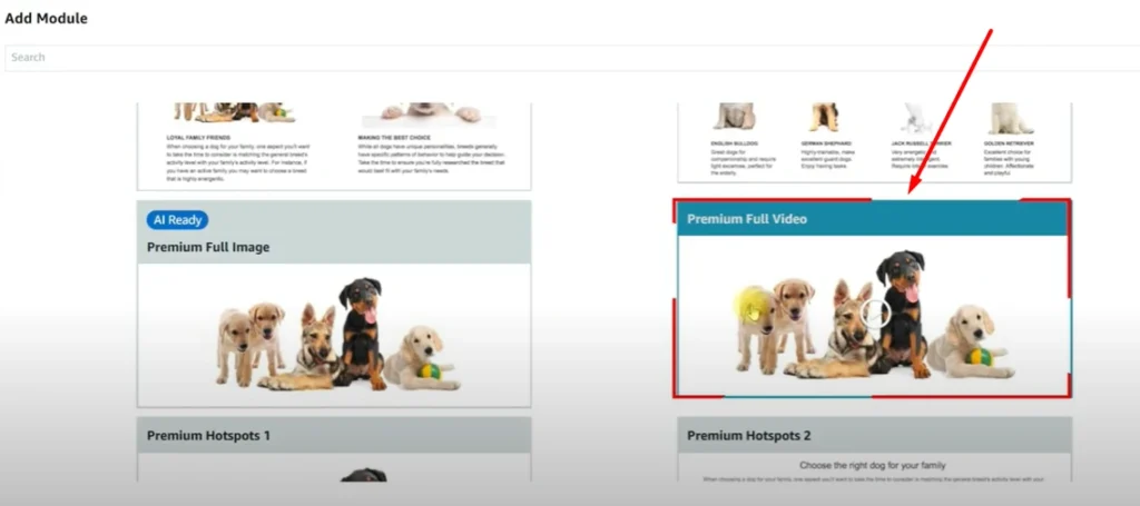
5. Premium A+ Content: Must-Have Elements for Maximum Impact
Premium A+ offers advanced modules most sellers neglect:
- Full-Width Banner Images
- Interactive Image Carousels
- Video Modules (short demo or storytelling)
- Q&A Module (reduces buyer hesitation)
- Advanced Comparison Charts
Compare features, price, and reviews — not just product lines.
Premium A+ Content Secret:
- Shows 20%-30% higher CVR than Basic A+.
- Decreases bounce rate drastically.
6. Advanced Tips to Supercharge A+ Content Performance
Use High-Intent Keywords in Crawlable Text – Example: “natural handmade soap for sensitive skin” — better than “best soap.”
Make Every Module Mobile-Friendly – 70%+ of Amazon shoppers buy via mobile.
Include Social Proof – Awards, media mentions, customer testimonials.
Optimize for Page Speed – Light images under 500kb; fast load keeps buyers engaged.
Run A/B Tests – Test multiple layouts via Amazon’s Experiments feature.
Consider Eye-Tracking Principles – Place best info (like offers) where eyes naturally land — top-left and center.
7. Why A+ Content Strategy Delivers Better Results
At Ecomclips, we’ve designed A+ Content for over 1000 brands — from beauty to supplements to electronics — and here’s why our method wins:
- Proven Data-Backed Frameworks
- Full Amazon SEO Optimization
- Real Conversion Rate Boosting Strategies
- Custom Design, Not Cookie-Cutter Templates
Example Brands Helped:
- Skincare Brands (30% CVR boost)
- Supplement Brands (25% higher AOV)
- Fashion Labels (Better Trust Scores)
Want the same success?
📧 Contact: info@ecomclips.com
8. Conclusion — Your A+ Content Upgrade Checklist
Before you publish (or fix) your A+ Content, use this Amazon A+ Content Success Checklist:
- Clear Brand Story
- Minimal Text, Max Visuals
- High-Quality Lifestyle Images
- Keyword-Optimized Crawlable Text
- Video Module Included (if Premium)
- Unique Selling Points Prominently Displayed
- Comparison Chart to Cross-Sell
- Trust Badges & Certifications Visible
- Responsive Mobile Design
- Fast-Loading Assets
- A/B Testing Performed
Key Takeaways:
- A+ Content is NOT optional — it’s your secret conversion weapon.
- Avoid common mistakes: walls of text, unclear images, poor flow, no video, generic claims.
- Use Ecomclips’ proven structure for higher sales, better ranking, and loyal customers.
Want Your Listing Audited for FREE?
👉 Reach out to our A+ Content Experts at info@ecomclips.com for a personalized Amazon listing audit and get a custom roadmap to double your sales potential.