In the competitive Amazon marketplace, A+ Content (Enhanced Brand Content) is a powerful tool for converting browsers into buyers. However, even minor mistakes can lead to significant revenue loss. US sellers often underestimate the impact of poor A+ Content strategies, resulting in diminished visibility, lost trust, and missed sales
If your Amazon ads are solid, your product is great, and your branding looks clean — but your sales still feel stuck — there’s a silent killer you might be missing: bad A+ content.
Let’s be real. Today’s Amazon shoppers don’t read long blocks of text. They skim, scroll, and scan. And when your A+ content is missing, messy, or misused — your conversions take the hit.
In this article, we’ll uncover the 7 most damaging A+ content mistakes U.S. sellers are making in 2025 — and how you can fix them to boost conversions by up to 20%.
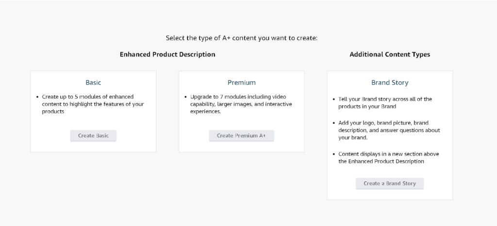
Mistake #1: Not Having A+ Content at All
Still relying only on bullet points and product descriptions?
That’s like showing up to a pitch meeting in your pajamas.
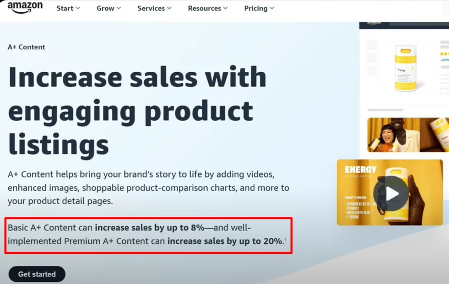
Sellers without A+ content miss out on trust, engagement, and sales. In fact, Amazon reports that Basic A+ Content can boost conversion rates by 8%, while Premium A+ can increase it by up to 20%.
Why A+ Content Matters:
- It visually explains your product in a way text never can.
- It builds credibility and brand identity.
- It answers questions and reduces returns.
- It drives conversions and customer confidence.
✅ Pro Tip: Even if your product is strong, skipping A+ means you’re silently losing customers to competitors who invested in visuals.
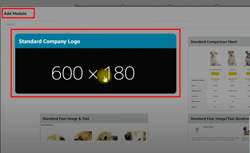
Mistake #2: Not Utilizing All A+ Content Modules
You can add up to 7 modules in A+ content — and yet, many sellers only use two or three. That’s like renting a billboard and only using a corner of it.
Must-Use Modules in Basic A+:
- Brand Logo + Tagline – Establish brand trust.
- Key Features with Images – Highlight benefits.
- Comparison Chart – Drive traffic to related products.

- Lifestyle Shots – Help shoppers visualize real use.

Premium A+ Must-Haves:
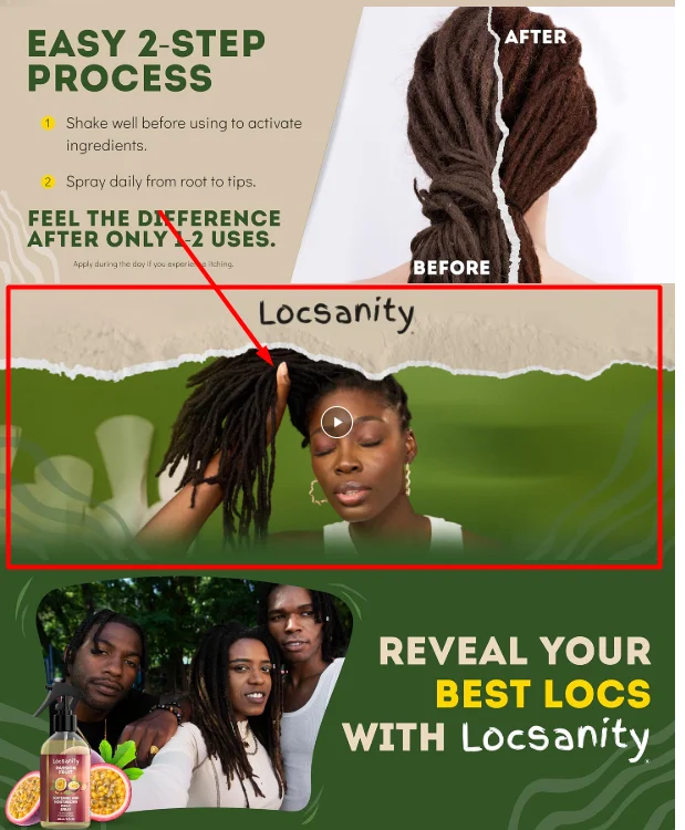
- Video Module – Increases engagement and shows product usage. Engage your audience instantly by showing your product in action. Videos boost time-on-page and help build trust through real demonstrations.
- Image Carousel – Adds depth and movement. Let customers interact with multiple images in one frame. This feature adds depth, highlights key angles, and keeps users scrolling longer.
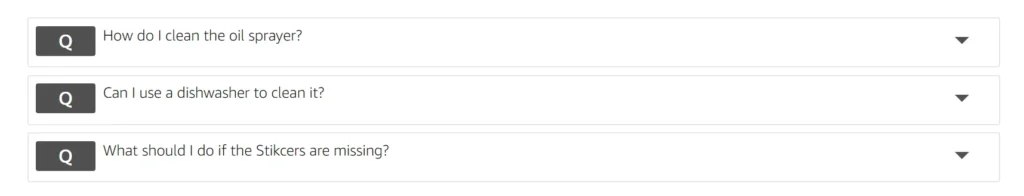
- Q&A Module – Addresses buyer hesitations directly. Answer common concerns upfront to reduce return rates. Directly addressing buyer questions improves confidence and conversion.
✅ Structure that Converts:
- Brand story & logo: Showcase your brand’s mission, values, and identity. A clear brand story builds emotional connection and loyalty.
- Benefit-rich image blocks: Use bold visuals and short copy to highlight product advantages. Focus on how your product solves problems or improves daily life.
- Lifestyle visuals: Help customers picture your product in real-world use. Lifestyle images enhance relatability and emotional appeal.
- Product comparison: Highlight your product’s key features alongside other options. This helps buyers quickly see why your product is the better choice — whether it’s superior quality, better pricing, or more functionality. A clear, side-by-side layout reduces buyer hesitation and drives faster decisions.
- Video module: A product video immediately captures attention and increases engagement. It allows customers to see the product in use, understand its benefits, and connect emotionally through storytelling or real-life scenarios. Adding video can boost conversion rates significantly by building trust and answering questions visually.
- Customer Q&A: This module addresses common buyer concerns before they ask. By answering frequently asked questions directly on the listing, you reduce uncertainty, build trust, and help shoppers make faster, more confident purchase decisions. It’s also a great way to highlight key features or usage tips in a natural, helpful format.

- Trust signal (testimonial, certification, etc.): Trust signals like customer testimonials, expert endorsements, or third-party certifications reinforce product credibility. They show that others have had positive experiences and that your product meets industry standards or safety requirements. These elements can significantly reduce buyer hesitation and improve conversion by reassuring first-time customers.
Mistake #3: Not Optimized for Mobile Viewers
Over 60% of Amazon traffic is mobile — and if your A+ content looks amazing on desktop but breaks on mobile, you’re losing shoppers fast.
- Tiny, Unreadable Fonts
Fonts that look fine on desktop often appear too small on mobile. This makes it hard for users to read product info, leading to frustration and drop-offs. - Cropped or Stretched Images
Images not optimized for mobile may appear distorted or cut off. This hurts the professional look of your listing and reduces product appeal. - Text Overlapping Graphics
When text is placed on busy or unresponsive backgrounds, it can overlap or become unreadable on smaller screens — damaging clarity and trust.
✅ Fix It the Right Way
- Use Larger, Mobile-Friendly Fonts
Aim for at least 16px font size and clear font styles that display well on all devices. Prioritize readability over design. - Stick to a One-Column Layout
Avoid complex multi-column formats. A simple, vertical layout ensures smooth scrolling and easier navigation on smartphones. - Always Test on a Real Smartphone
Don’t rely on Seller Central previews — they aren’t fully accurate. Check your A+ content and listings directly on an actual mobile device to ensure everything looks right.
Mistake #4: Using Low-Quality or Irrelevant Images
Amazon shoppers buy with their eyes. If your images are blurry, dark, or overly edited, they’ll scroll right past your product.
Show How to Use the Product
Help shoppers understand the product in action — this reduces confusion and improves buying confidence.
Highlight Real Benefits
Go beyond features. Show how the product improves daily life, solves a problem, or adds value.
Look Clean, Trustworthy & Consistent
Use a cohesive visual style with clear branding, high-quality resolution, and no clutter. Consistency builds brand trust.

Technical Tips for A+ Images
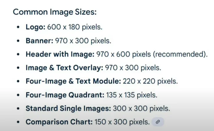
✔️ Minimum Resolution: 970×600 px
Amazon recommends this size for sharp, professional images across all devices.
✔️ Even Lighting & Consistent Editing
Maintain balance — no harsh shadows, blown-out highlights, or inconsistent color tones.
✔️ Avoid Over-Editing
Skip unnecessary filters or extreme edits. Stay true to your brand’s look and feel for a more authentic presentation.
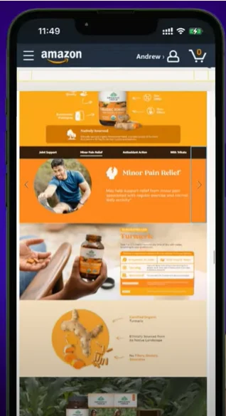
Use Lifestyle Photography
White background images are useful, but lifestyle shots show your product in real-world use — helping customers visualize it in their own lives. These images build emotional connection and boost conversions.
Mistake #5: Not Telling a Story
Most A+ content just dumps features. But high-converting brands do one thing better — they tell a story.
A+ Story Structure That Works:
Hook – Bold Image or Tagline to Catch Attention
Start with a powerful hero image or headline that instantly grabs attention.
This could be a bold product shot, a benefit-focused tagline, or a clean visual that sets the tone.
The goal is to stop the scroll and make the customer curious enough to explore further.
Why It Matters – Show What’s In It for the Buyer
Explain the real-life benefit the buyer will get — not just the feature.
Use compelling visuals and short copy that answers: “How does this product make my life better?”
Focus on solving a pain point or delivering a unique value.
How It Works – Simple Visuals or Step-by-Step Usage
Break down the product’s use or function in a clear, simple format.
Use iconography, numbered steps, or illustrations to visually explain how to use it.
This removes uncertainty and makes your product feel easy and intuitive.
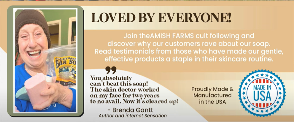
✅ Proof – Reviews, Demo Shots, or Testimonials
Build trust with social proof: real customer testimonials, star reviews, or demo images.
Highlight genuine feedback that reflects satisfaction, problem-solving, or product quality.
This reassures the buyer and strengthens your brand’s credibility.
CTA – Comparison Chart or Q&A That Nudges Purchase
End with a smart call to action that helps finalize the purchase.
Use a comparison chart to highlight your product’s advantages, or a Q&A module to clear last-minute doubts.
Make it easy for the buyer to say yes with confidence.
✅ A narrative sells. Make your customer feel understood and guided, not just marketed to.
Mistake #6: Overloading with Text
Amazon A+ is a visual medium, not a blog. If your A+ content looks like an essay, it’s probably getting skipped.
Common Offenders:
- Paragraphs of dense text
- Technical jargon
- Poor font-to-image ratio
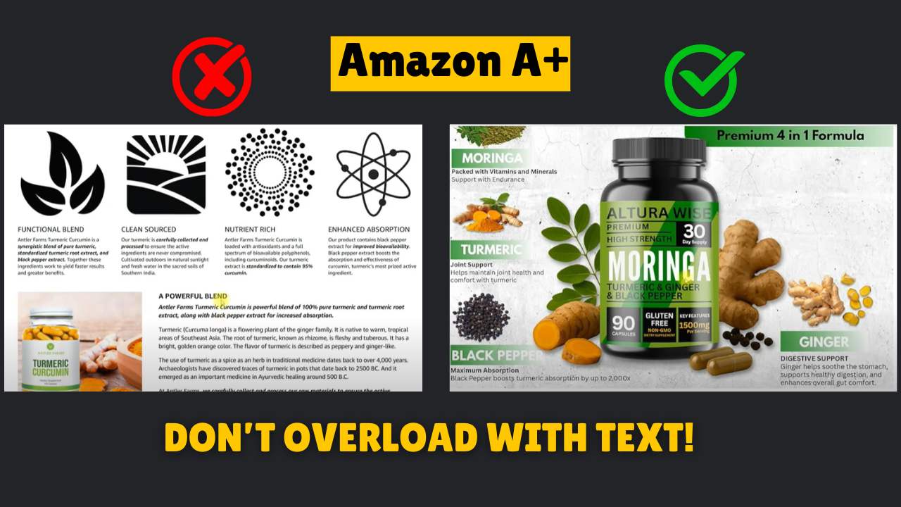
Fix It:
- Use short, punchy headlines
- Pair minimal text with bold visuals
- Focus on clarity over word count
Mistake #7: Ignoring Trust-Building Elements
In 2025, trust isn’t optional — it’s everything. With competition at an all-time high and consumer skepticism growing, buyers want proof before they click “Add to Cart.” Yet many sellers still overlook trust-building in their A+ strategy, missing out on one of the most powerful conversion tools available.
🗣️ “People don’t buy products. They buy trust.” — Seth Godin
Customers aren’t just comparing features — they’re comparing credibility. If your listing doesn’t feel reliable, professional, and endorsed by others, they’ll choose the next seller who does.
Add These to Build Trust:
- Verified badges or certifications
- Customer testimonials
- “As seen in” press logos
- Comparison charts that highlight unique advantages
- Q&A modules addressing common hesitations
Goal: Don’t assume trust is built by default. Design it into your A+ content. When a shopper thinks, “This brand feels legit,” you’ve already won half the battle.
Final Thoughts: A+ Isn’t Optional Anymore
Every listing without A+ content — or with poorly executed visuals — is leaving money on the table.
Whether you’re just starting out or scaling an Amazon brand, investing in optimized, strategic A+ content can boost trust, clicks, and conversion — fast.
So take time to:
- Audit your current listings
- Build with a mobile-first, visual-first mindset
- Tell your story and guide your shopper to “Add to Cart”
Because the brands that win on Amazon in 2025?
They don’t just show up.
They show off.
Ready to elevate your Amazon listings and crush your sales goals?
Let’s create A+ content that converts — reach out today and start standing out from the competition!
Contact Us: info@ecomclips.com